A five-person startup and a two-hundred-person company walk into the same interior design conversation. Sounds like the setup to a joke, right? Except it’s not funny when the startup ends up copying a corporate layout that eats half its budget, or when the large company clings to outdated cubicles because “that’s just how offices look.”
The truth is, business size changes almost everything about how an office should be designed. What works beautifully for a lean team of ten can feel completely wrong for an organisation managing multiple departments. Yet so many businesses make design decisions based on trends they saw online, without asking whether those trends actually fit their scale. Let’s talk about what really matters when planning an office, whether you’re running a small growing team or managing a large, multi-department company.
Why Business Size Changes the Design Conversation
Small businesses usually care about flexibility, cost efficiency, and creating a space that still feels professional despite a limited footprint. Large businesses, on the other hand, deal with structure, departmental separation, and the challenge of maintaining culture across bigger teams.
This is exactly why generic office interior design trends shouldn’t be copied blindly. A trend that suits a 15-person marketing agency might completely fail in a 300-employee finance firm, and vice versa. Understanding your business size, growth plans, and daily workflow should always come before picking a design style.
Design Priorities for Small Businesses
Small businesses often operate with tighter budgets and smaller spaces, but that doesn’t mean the design has to feel cramped or underwhelming. In fact, some of the most creative office designs come from businesses that had to think smart within limited square footage.
Here’s what typically works well for smaller teams:
- Multi-purpose furniture. Desks that double as storage, foldable tables for meetings, and modular seating save space without sacrificing function.
- Open layouts by default. With fewer employees, open floor plans usually work better since noise and distraction are less of an issue.
- Strategic use of color and lighting. Smaller offices benefit hugely from natural light, light color palettes, and mirrors that create a sense of openness.
- Scalable design choices. Choosing furniture and layouts that can expand as the team grows saves money on future renovations.
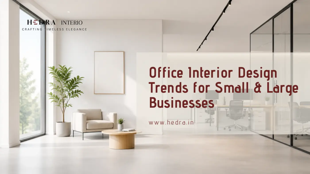
A great example is a small digital marketing firm that turned a compact 800 square foot office into a vibrant, collaborative space simply by using glass partitions instead of solid walls, keeping the layout open while still defining separate zones for calls and quiet work.
Design Priorities for Large Businesses
Large businesses face a different set of challenges entirely. With more employees, more departments, and often multiple floors or branches, consistency and structure become the priority.
Key considerations for larger office spaces include:
- Zoning by department. Sales, HR, finance, and leadership teams often need clearly defined areas with different acoustic and privacy needs.
- Wayfinding and signage. Larger offices need clear navigation so employees and visitors aren’t wandering around lost.
- Consistent branding across floors. Maintaining the same color themes, materials, and design language across multiple floors reinforces company identity.
- Dedicated wellness and break areas. Bigger teams benefit from proper break rooms, quiet zones, and even wellness rooms to support employee mental health.
Large companies also need to think seriously about scalability. Growth doesn’t stop, and a good design plan should account for future headcount without requiring a complete redesign every two years.
Where Small and Large Businesses Actually Meet
Regardless of size, some design principles remain universal. Every business, big or small, benefits from:
- Good acoustics to reduce noise fatigue
- Ergonomic furniture that supports long working hours
- Natural light wherever possible
- A layout that reflects the company’s actual culture, not just aesthetics
- Flexibility to adapt as team needs shift
This is really the heart of smart office interior design trends today. It’s not about copying a look. It’s about designing around real behavior and real business needs.
Expert Tips for Getting Office Design Right
Based on real project experience across different business sizes, here are a few things that consistently make a difference:
- Always design around workflow, not just aesthetics. A beautiful office that disrupts how people actually work will frustrate employees fast.
- Invest in acoustic solutions early. Whether small or large, noise complaints are one of the most common post-renovation regrets.
- Don’t ignore future growth. Even a small business should plan for at least 20 to 30 percent growth in headcount when designing the layout.
- Prioritize natural light. It genuinely affects mood, energy, and productivity more than most business owners realize.
- Get employee input before finalizing plans. The people using the space daily often spot practical issues that designers might miss.
Common Mistakes Businesses Make
- Copying trends without considering scale. A layout that works for a large tech company won’t automatically suit a five-person startup.
- Underestimating storage needs. Both small and large offices often forget how much physical storage employees actually need.
- Overspending on aesthetics, underspending on function. A gorgeous office that lacks proper meeting rooms or quiet zones creates daily friction.
- Ignoring acoustics in open layouts. This mistake shows up across businesses of every size and is one of the most common regrets after a renovation.
- Designing once and never revisiting. Business needs change, and offices should be reviewed periodically rather than treated as a one-time project.
Benefits of Getting Office Design Right
When office design matches business size and workflow properly, the results speak for themselves:
- Improved employee focus and reduced daily friction
- Better first impressions for clients and visitors
- Smoother scalability as the team grows
- Stronger company culture reflected through the physical space
- Long-term cost savings by avoiding repeated redesigns
Businesses looking into office interior design Calicut are increasingly prioritizing this scalable, workflow-first approach rather than chasing short-lived design fads.
FAQs
Does office design really need to differ based on business size?
Yes. Small businesses usually prioritise flexibility and cost efficiency, while large businesses need structure, zoning, and consistency across departments.
What’s the biggest design mistake small businesses make?
Overspending on non-essential aesthetic elements while underestimating storage and quiet workspace needs.
How often should a large business update its office design?
Most large businesses benefit from reviewing their layout every three to five years, or sooner if headcount grows significantly.
Is open office design better for small businesses?
Generally yes, since smaller teams experience less noise disruption, though some quiet zones are still recommended.
Who should businesses consult when planning an office redesign?
Working with an experienced interior design company in Calicut ensures the layout is planned around actual business workflow rather than just visual trends.
Ready to Design an Office That Fits Your Business?
There’s no universal formula for office design. What works for a scrappy five-person team won’t necessarily suit a growing enterprise with multiple departments, and pretending otherwise leads to wasted budgets and frustrated employees.
The businesses that get it right are the ones that design around their actual size, workflow, and growth plans rather than chasing whatever looks impressive on social media. At Hedra Interio, we design offices for businesses of every size, from lean startups needing smart, space-efficient layouts to large companies requiring structured, multi-department planning. Every project starts with understanding how your team actually works, not just how the space should look.
Reach out to Hedra Interio today for a free consultation, and let’s build an office that grows with your business.